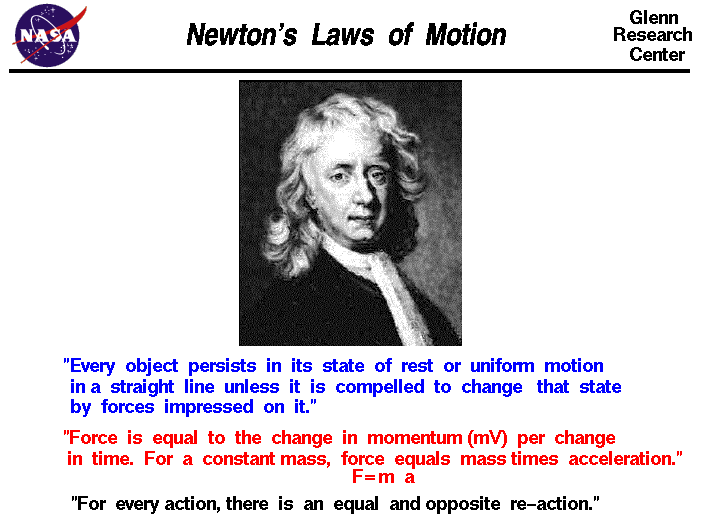
“Every object will remain at rest or in uniform motion in a straight line unless compelled to change its state by the action of an external force.” — Sir Isaac Newton, First Law of Motion, 1686, Principia Mathematica Philosophiae Naturalis.
First – Yes, yes, I know – it’s been a while since the last post. I am finding it very difficult to maintain Pandispatch as a “data-only” apolitical blog when the data correlates so strongly with governmental action, economic pressures, and social behaviors. Pandispatch was created to use facts and data to convincingly show that the pandemic was real. At the time, oh so long ago (weeks, even) I did not truly realize how real it would actually become nor what the real-world implications would be. Since that time the general media and our own experiences provide an abundance of revelatory information. Nevertheless, it remains difficult to grasp the nature of a pandemic. We are so accustomed to “once and done” disasters that our mental machinery is not well-tuned to understand a long-duration pandemic in terms of likely courses and outcomes. Governmental capabilities coupled with an oft-confused populace, undernourished science, and limited social resources does little to help with understanding or encourage a positive outlook.
Some may say that the situation is dire. According to universally accepted experts (Fauci, Birx, et al) the current opening of states may very well be catastrophic. Trying hard to avoid launching into a partisan skirmish, I tend to agree with them. To quote Donald Rumsfeld (yes, that Donald Rumsfeld) “we don’t know what we don’t know.” Still, it is very hard to believe that state governments do not have access to excellent scientific/ epidemiological advisors – which can lead to a conclusion that leaders may be willing to accept, consciously or subconsciously, some number of deaths in exchange for reinvigorated economic activity. Given the pandemic fatigue slowly engulfing all of us, one wonders if this might edge ever more deeply into “acceptable loss” territory for all of us as we await miracles of treatment and vaccine. Yeah. I offer this as more anthropological hypothesis than political screed.
Now back to Sir Isaac. His First Law of Motion applies to many things beyond objects in motion. In a sense it’s built into our thinking: when something seems to be going along nicely we expect it to continue going on in pretty much the same way unless something acts on it to change it. Newton was a smart guy – invented calculus (although Leibniz might disagree) and figured out the whole gravity thing – until Al Einstein messed things up. But we won’t go there today. If we did we would inevitably end up in the whole Werner Heisenberg uncertainty situation where who knows what’s what. We’re confused enough already [See, Rumsfeld].
In any case, as I was saying, most everyday things tend to keep moseying along in a regular clippity-clop fashion. Sure enough, the sun rose this morning (I know, I know, Copernicus & Galileo – the earth goes around the sun) but stay with me here. The sun rose this morning like it has every day since forever, and we expect it to do so at around the same time tomorrow morning – unless something acts to change this routine (like a black hole smashing into it and squeezing it to the size of a pea in which case we have bigger problems. You think a pandemic is bad? Black holes are so much worse). On the other hand if a black hole did happen not wander by, things would change instantly instead of dragging on for months or years, which is what we’re looking at with Covid.
In light of all this let’s look at the data [29-April, Evening]:
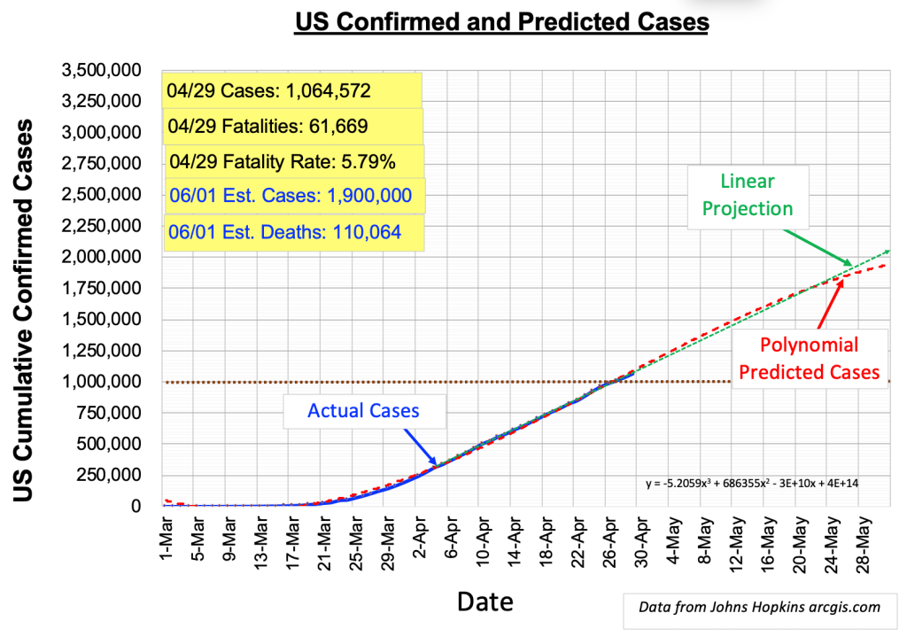
See the green dotted line, where it lines up with and launches off from the end of the blue line that plots the day-to-day number of cases? The green line is a projection of how things will likely continue if nothing changes. Would we expect this to abruptly change? No [See, Newton] — not unless something “acts on it” — that is, something happens that causes it to change direction (slope) or start “bending.” Bending is more likely since things that change seem to do so gradually. In that case the red dotted curve would be a better estimate. In the plots above noticed that the green and red lines are essentially the same, with the red bending so very slightly. For simplicity we’ll focus on the green line for the following discussion.
To illustrate what might happen if a “force is impressed” on the line: If every American decides now would be a good time to go out and get a massage and a tattoo, that would be a major change. We would expect, in two or three weeks (can take that long for the virus to show itself), the blue curve and green line to change direction and rocket upward. The green line currently hits ~118,000 cases on June 1. If the tattoo frenzy happens it will tilt more seriously upward and hit much higher than 118,000. This is a crazy example – I wouldn’t expect more than fifty or sixty million Americans to get tattoos on the same day — but you get the point.
One the other hand if we all elect to hibernate until a vaccine materializes (a year or two – come on, how hard could it be?) then one might expect the green line to continue on its merry way or even start bending until it’s flat. Then, when we distribute vaccine kits to all tattoo artists in 2021 and the whole of America gets inked and vaccinated, this would represent a force acting on the green line – i.e., a change – forcing it to definitely level out – that is, no (or very few) additional cases.
So here we are. As with most things, the situation will probably end up somewhere in between, with the blue and green lines moving this way and that as the months wear on. It all depends on how we behave. Tattoo or not tattoo, that is the question. Good luck, state governors.
One more thing. See this plot?
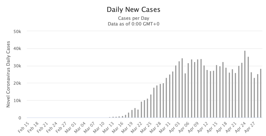
I know, this plot evokes fond (or not so fond) memories of high school statistics. Remember — you there in the back of the room? If you lean back and squint at it you will see a sort of fuzzy mountain range on the righthand side. Ignore the little valleys every 7 or so days – these are weekends, when we’re told the number of tests drop. A plateau like this, ragged as it is, is better than a slope upward, but not as good as one going down. Up is bad because it means more cases every day. Down is good because it means fewer every day. Right now we’re stuck roughly flat — the number of cases is about the same every day – which ends up being the cause of the green line in the other plot above. See how this all ties together? Math works like that. Newton would be very happy (if it weren’t for the whole Leibniz deal – thinks he’s so smart, how dare he claim to have invented calculus?) But that’s another story.
So what is the upshot of all this blue line / green line / mountain range stuff? We shouldn’t be surprised to see many more cases and a corresponding number of deaths going forward. Right now the average height of the mountain range is about 30,000 cases per day. Using a currently calculated fatality rate of ~5.8% we calculate 990,000 additional cases corresponding to about 100,000 fatalities by June 1. This is a relatively low-confidence estimate [See, Rumsfeld]. Since the number of confirmed cases will increase in proportion to increased testing we should see a fatality rate fall, perhaps significantly. On the other hand, if people can’t contain the urge to get that tattoo they’ve always wanted, there’s no telling how it will got (probably up) since, say it all together now: “we don’t know what we don’t know.” 📓
