“Facts are stubborn things; and whatever may be our wishes, our inclinations, or the dictates of our passion, they cannot alter the state of facts and evidence.” — John Adams
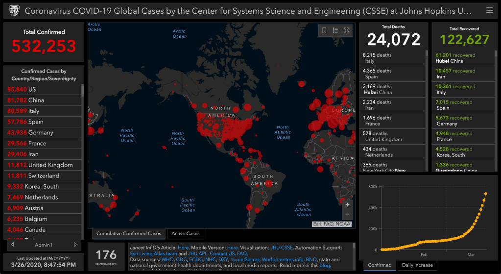
This is a longer-than-usual post, so settle in! Here are a few snapshots from today’s Johns Hopkins site. The axes are hard to read, but you get the idea.


And here’s our plot of this data including predicted growth.
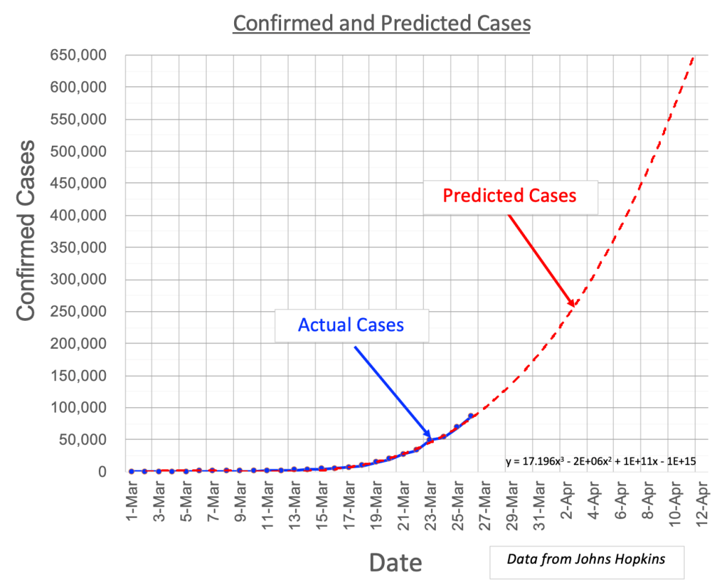
Today the number of confirmed cases exceeds 85,000. Current fatality rate is about 1.4% (percent of confirmed cases that result in death). Trends appear to be on track to reach over 200,000 cases by the end of March and approach 650,000 by Easter. Great. Really great. Just the facts. Thank you Detective Friday.
But before we go all Chicken Little let’s think about what’s really going on here. The red curve showing 650,000 at its peak is a “best-fit” to the number of cases recorded to date. There’s a lot that goes into this “best-fit” thing. What follows is a (longish) attempt to interpret what this means and apply some (hopefully less alarming, more useful) perspectives.
To begin with, the recorded data (blue curve, number of cases), which is the basis for the red curve, has errors. In any experiment, all recorded data has errors. For Covid-19 we almost certainly have missing data, lost data, mis-reading of doctor’s scribbles, wrong numbers, etc., etc. On top of this, this “noisy” data is sent to a center (Johns Hopkins) where additional errors may be introduced. So can we even trust the data that is ultimately published?
Yes — if we keep in mind that it is not “perfect.” Scientists typically assign something like a +/- 5% or so “error band” around results like they do in political polls. This helps when we try to interpret the data. Let’s do that here. The number of cases reported on 25-March was 69,171. If we apply +/- 5% we get a range of 65,712 – 72,630 cases. Wow, that’s so much more helpful. Not really, its just gives us an idea of the confidence we might have in the data.
But wait! There’s more! Don’t give up. I promise this will get even more confusing…!
Let’s talk about trends. This is what we are really interested in because they give us a clue as to what’s coming next.
A trend is nothing more than an educated guess at how things are likely to go based on everything you know to date (number of cases). Like real data, trends have issues. The more data you have, and the less noisy it is — the better you can estimate a trend. Now we’re getting somewhere. The implication is clear: more data = higher confidence, which is what we really want to know when considering how many pallets of toilet paper to hoar.
Great, let’s just wait for more data. Oh, wait — we sort of need to know now. We have to make sure that little Oscar has enough mac and cheese.
So. Trends. Are they helpful or not? Let’s extrapolate (guess) what the data is likely to be in the next month or so. The red curve above is a ”trend-curve” that shows us getting to about 650,000 cases by Easter. Uh oh. That looks bad. Still, it does fit pretty well on top of the blue (confirmed cases) curve, so it looks like a reasonable fit.
This is where we have to consider other factors that might influence the new data we get going forward. Factors like social distancing, “lockdown,” inaccurate and/or missing and/or insufficient testing – all can and will vary over time. These affect the recorded data and, more importantly, new data as it comes in. (Then there’s the major effect of a vaccine down the road. But let’s not worry about that just yet). We’re focused on the deteriorating mayhem escalating day after day with all these kids underfoot. Oscar? Oscar – where are you?
Putting the vaccine effect aside for the moment let’s just deal with data (number of cases) arriving in the next month or so.
Believe it or not there might actually be some hope here. The effects of social distancing, etc. may in fact help keep the blue curve from growing as quickly as the red trend curve, resulting in less than 650,000 actual cases by Easter. There’s no guarantee of course, and things can get more confusing yet (as if all this isn’t confusing enough!). For example, lockdown has been shown in China and elsewhere to have a major effect at reducing the number of cases. Hurray! That should help keep that pesky blue curve down!
On the other hand, my friendly neighborhood bean counter reminds me that we may be missing a lot of data due to insufficient testing – so the actual numbers may be much larger. On the third hand, even if the numbers do vary unexpecxtedly (larger or smaller), we are still mostly interested in the trend. That is, for example, if the number of cases increases for a few days but then starts dropping, we would be forced to re-calculate the red trend-curve to follow suit and also drop – resulting in fewer than 650,000 cases at the end.
I don’t know about you but I am more than a little confused just about now. Let’s see if we can summarize a little more succinctly: (1) We know what has been observed and recorded (number of cases = data), (2) We know that this data has errors, (3) We can guess, based on what we know, how things may go (trend) in the next few weeks, and (4) We know that, like the data itself, our guess is subject to error and may show faster or slower growth. Hopefully slower.
Sort of unsatisfying, I know.
But it’s where we’re at on this Thursday March 25, 2020. We have what we have. Certainly Johns Hopkins and CDC have significantly more sophisticated models to predict trend. What I show above is simplified but uses the same data as they have. Hopefully this post will at minimum help a little with understanding what goes into their models and predictions, and maybe even assign a level of confidence to what they are saying.
For now, sorry to say, we need to wait a little longer to get a better handle on trends based on what’s happening in New York and the rest of the country. Remember, as mentioned in a previous post, small changes can exert enormous influence on future outcomes! So we wait. Need facts.
Meanwhile…A number of readers have mentioned that some of these posts have been sort of gloom-and-doomy. Early posts were, for the most part. They were intended to sound the alert that this pandemic is a real and once-in-generations event (like 1918). As time goes on though it is nearly impossible to avoid the bombardment of data and predictions and opinions issuing from every media orifice. So, going forward I will attempt to make these posts more interpretive, with the goal of offering a perspective and insight into what we are hearing and seeing so that we can plan for a better tomorrow (I know, a cliché. “Last, but not least, avoid clichés like the plague.” – William Safire).
Finally, in what might be interpreted as a small violation of the apolitical promise of this site, the current consensus of leading epidemiologists is that the best approach to lowering the blue curve, and corresponding red trend curve, is to call for a multi-week national or carefully monitored tiered national lockdown.
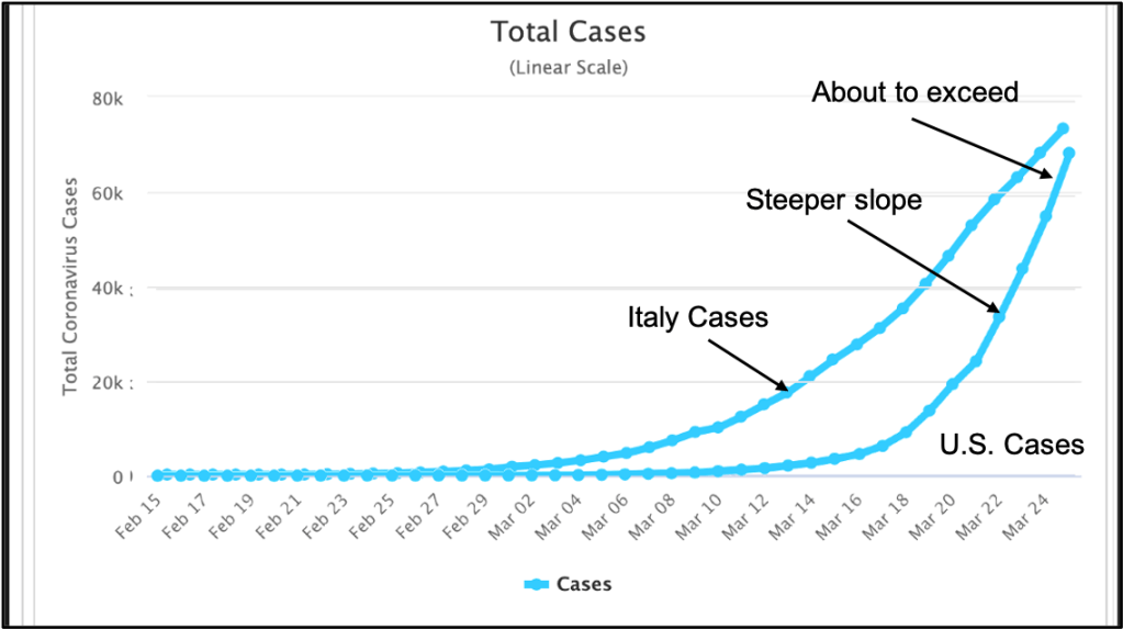
Data plotted below from a few days ago shows the number of U.S. cases rapidly approaching Italy’s. Italy has one of the worst outbreaks on the planet to date. Perhaps more importantly we see the U.S. curve rising at a significantly faster rate than Italy’s, portending a potentially catastrophic outcome. On the other hand it’s possible that the curve could start bending down unexpectedly due to any number of currently unknown factors. Right.
A final understatement: We are in a period of great uncertainty. Let’s see what happens tomorrow. Just-released results of UK and US models that include data-driven insights into Covid-19 spread based on unexpected asymptomatic infection rates may be far lower than expected, suggesting that our 650,000 estimate may be much too large. (To be honest it looks impossibly large to me at the moment). Will keep you updated.
Speaking of plagues, I better go check on Oscar. I see trails of toilet paper streaming down the hallway. He doesn’t quite grasp the gravity of the situation. Guess I’ll try to explain it to him – again. Two years old and he still doesn’t get it. Some people…!