
Here’s the data table (updated evening 22-March):

….. So how long is this going to go on? How long before lockdown with our loved ones leads to madness? We hear estimates ranging from a few weeks to a few months to many months. The answer? It all depends. Yeah, not too helpful. There are so many factors at play here that even a small change in one or two can majorly affect everything downstream. This by the way is a fundamental principle of chaos theory. But that’s another story. We’ve got enough chaos to deal with at the moment.
If you look closely at the table you will see that the predicted number of cases has been modified starting 21-March. As we expected, increased testing results and mitigation measures are beginning to undermine the simple “double-every-3-days” formula, affecting its ability to accurately predict the number of cases going forward. So now what do we do?
It turns out that there is a mathematical technique that enables us to determine a trend based on a given set of data. In our case we can use this to “fit a curve” to our 22 data points (March 1-22) and extend that curve to predict what is likely to happen going forward to March 31. The resulting curves are plotted below. It’s then a simple matter (really!) to draw values from the dashed red “trend” curve to fill in predicted values (shaded green) in the table above.
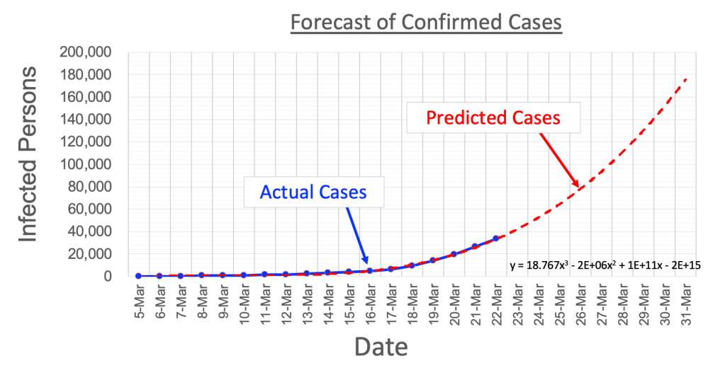
Seriously, it’s not as complicated as it sounds! But if it all seems a little too off-putting just think of it as a mathematical way of “eyeballing” how the curve is going to grow. From the curve and the table we see 179,000 cases predicted by 31-March. How accurate is this likely to be? Well … not to get too technical, but … we’ll see. Lacking details of increased testing and mitigation we can only say that this estimate is not unreasonable. This is what’s known as weasel-wording in the technical community (and many others!). Nevertheless I will continue to update the trend estimates as more data comes in. As you might expect, more data will help us calculate better predictions.
I have not estimated the number of deaths through the end of March. If we use the 1.26% fatality-rate estimate for 22-March we get an estimate of 2,200 deaths. Harking back to the estimated 40,000-60,000 annual deaths attributable to ”regular” seasonal flu we might be tempted to consider 2,200 not so bad. But look at the red trend curve again. See there at the end — how it’s beginning to head rather alarmingly skyward? This portends catastrophe (not to ruin your mood any more than I’ve already done!). Based on this we can see why many reliable studies predict maybe a million or more deaths. And this does not even address collateral damage due to overwhelming health care resources. That’s a story for another post.
Wow, this is getting pretty depressing. Let’s finish up with some good news. Let’s see… got enough toilet paper for the duration, so there’s that. Case of schnapps, check. Mac and cheese, check. Seriously, it looks like we may not be headed for the worst case if we can all manage to keep our heads down and go hard-core introvert. And assuming a vaccine will mosey on in early next year to help bend the curves down there is some hope that we may get back to (our new) normal by next summer sometime. Meanwhile we’ll keep an eye on the data and see if it can help us better understand what’s going on and navigate through this mess in the near-term.
