
There are times when fear is good. It must keep its watchful place at the heart’s controls. – Aeschylus
Today’s doom-clock: 10 minutes to midnight with a chance of well, you know.

…..Now that we have that out of the way, here’s the data table:
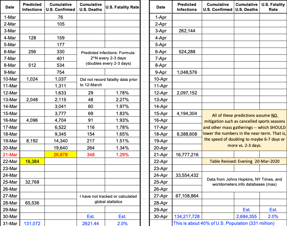
The alarming number of confirmed cases reflects a combination of 2^N growth and an increase in the number of tests and a decrease in fatality rate. This is not unexpected, as discussed in previous posts. The next update post will attempt a recalibration of the table to better show what’s happening. As time goes on we should expect even more complicated combinations of doubling formula, testing increases, and mitigation/suppression effects – all greatly impacting the ability to predict.
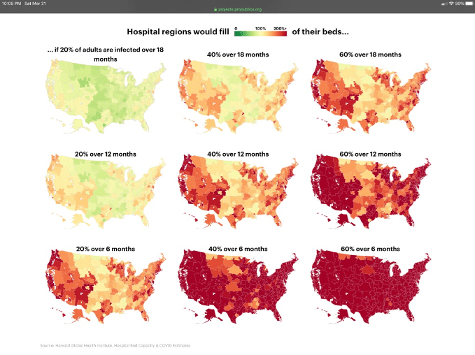
The following chart shows recent results from a Harvard Global Health Institute study of national hospital capacity as a function of geography, % of adults infected, and period over which care is needed. Red is bad. Best case is upper left for 20% of adults infected over 18 months, in which case the demand curve is “flattened.” Worst case is lower right for 60% of adults infected over 6 months. This is the demand “tsunami” that is bandied about in the media, corresponding to the demand curve not being flattened by containment/mitigation/suppression measures. Which one of the nine cases is most likely? Take your pick. One might make a case for the middle (40%, 12 mo.) map as sort of a best-guess “somewhere in the middle. Multiple sources indicate an anticipated range of 40% – 80%.
Can we trust this model? A model is a model. Having constructed hundreds of models over the last 40 years I will share a not-so-hidden secret – the success of any model depends on assumptions, number and range of factors governing its behavior, and dependence on solid data for development and validation. The model yielding the maps below has been created by a Full Professor at the Harvard Global Health Institute, lending it a fair amount of credibility. Covid-19 data from China, South Korea and others were used as sources in its development.
As usual the information in this post is intended to help you understand what’s going on. It is not intended to alarm you. Measures underway by government and health care authorities should help mitigate some of these disturbing predictions. We will keep you updated. Stay tuned for a new site name that better reflects the purpose of this site.
Finally, an attempt to assuage some of this gloom, from a more youthful perspective: